Renew by 12/15 for 1/1 coverage. Stay covered with Ambetter Health.

Components on Ambetter Redesign
Template Styling
- testing bullet text
Template by default has several color background defaults. Background Color Boxes can be used to add additional options (see Background Color Boxes below).
- Page Header - White
- Body Area - #F7F7F7
- Page Footer - #333333
Template width is not framed. Currently, most components fit into the center 80% of the browser.
Components can sit flush with the page header and footer (no gutter)
November 1 – January 15
Text Sizes and Styling
Heading 1 - 32px Roboto. Black #333333.
Heading 2 - 29px Roboto. Black #333333. Extra leading below.
Heading 3 - 23px Roboto. #6E6E6E
Heading 4 - 20px Roboto and bolded. #6E6E6E
Paragraph Text - 18px Roboto. #6E6E6E
Bulleted Lists
- Bulleted Lists
- Smaller bullets than other templates.
- Brand color.
Numbered Lists
- Numbered Lists
- Smaller numbers than other templates.
- Brand color.
Accordion Group
Accordions haven't been specifically styled for redesign template yet. Formatting is still pulling from previous styling. Changes may come with the next round of redesign edits.
Heading 3
Heading 4
Lorem ipsum dolor sit amet, consectetur adipiscing elit, sed do eiusmod tempor incididunt ut labore et dolore magna aliqua. Ut enim ad minim veniam, quis nostrud exercitation ullamco laboris nisi ut aliquip ex ea commodo consequat. Duis aute irure dolor in reprehenderit in voluptate velit esse cillum dolore eu fugiat nulla pariatur. Excepteur sint occaecat cupidatat non proident, sunt in culpa qui officia deserunt mollit anim id est laborum.
- Lorem ipsum dolor sit amet
- consectetur adipiscing elit
- sed do eiusmod tempor incididunt ut labore et dolore magna aliqua.
- Ut enim ad minim veniam,
- quis nostrud exercitation ullamco laboris nisi ut
- aliquip ex ea commodo consequat.
Ambetter First Visit Modal
Works similar to the standard First Visit modal but has a container that allows for other components to be placed inside it for more flexibility. This can't be edited in AEM Classic. How the modal appears below is what it will look like in preview mode as a pop-up.
Ambetter Health Plan Item
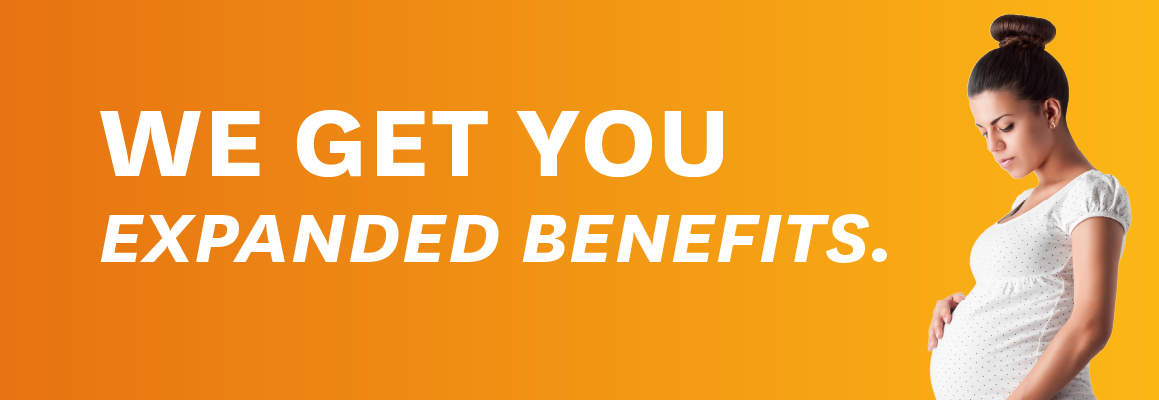
Ambetter Homepage Banner
No formatting on text... you get what is set. White font uses half the browser width. Drop shadow helps with accessiblity but still likely needs darker image to meet contrast. Image does not resize to fill width of browser (so needs larger image uploaded). Default height of image is set to 325px but will expand on smaller tablet/mobile to accommodate text. Crops from the right (no zooming).
Not specifically styled for redesign. Text sits outside the center 80%.
Ambetter Landing Header with CTA
Ambetter Landing Header
Uses smallest height possible according to text. Image doesn't resize to match width. Crops from right (no zooming).
Title box only comes in raspberry at this time. Title is all caps (no formatting, you set what is set). Subtext, also all caps, sits outside title box.
Colored stripe across bottom can be changed to any color.
Many components can also be set within Column Controls broken down into 2-columns at 10% widths (20/80%, 30/70%, 40/60%, etc) or 33/33/33%. Those that have not been tested within column controls include image banners and cards/carousels.
Ambetter Lead Form
Ambetter Redesign Lead Form
Background Color Box
Background Color Boxes span the entire width of the browser. Font is either White (for dark colored boxes), Black (for light colored boxes) or brand color (for white). Background color boxes come in all programmed brand colors, "light brand color" used on tables, and now several set gradients (according to brand standards). Images can be used as a background, but will drop off on mobile view to show simple color.
Background Color Boxes can also be placed within another box if full-width is not desired.
Default/None: CSS styles, no color background, #6e6e6e font color.
"(H5) QUOTE WITH IMAGE Lorem ipsum dolor sit amet, consectetur adipiscing elit. Donec et feugiat quam, quis aliquet arcu. built in quotes should be removed"
Grape Gradient: #6F2C91 to #A154A1
Lime Gradient: #AAC832 to #D6E040
Orange Gradient: #F58220 to #FDB913
Raspberry Gradient: #CB177D to #A5247F
Teal (Ambetter) Gradient: #008080 to #006565
Light Brand Color
Benefits Box
Used to highlight specific Ambetter plan benefits and describe them.

Title Text
Benefit Text
Title 2
Benefit Text 2
Benefits content with slides.
Benefits section contains member benefits information.
Best Value Cards
Ambetter uses the Best Value cards to diplay their various plan offerings. All text and images are formattable though, so could be customized to an extent. Three cards max. Center card always larger. Font size happens by default.
On mobile view, cards carousel.
No buttons or other components able to be combined at this time.
Buttons
Redesign template allows for all standard buttons, "brand color", plus some redesigned rounded buttons. Colors for rounded buttons set at this time (but more could be added). Buttons span full width if not in column control.
Button Modal
Adds a pop-up dialog to a specific button on the page. The dialog appears as a container that can have other components placed inside it.
This component needs to be configured with a unique ID so multiple modals can be used on a page. In order for a Button component to bring up this modal, the ID for the modal needs to be added to the Button component configuration in the "Button Modal Link" field.
How the modal appears below is what it will look like in preview mode as a pop-up.
Call to Action Boxes
Call to Action Boxes have not yet been styled for redesign template. Boxes will be full width unless placed in background color boxes. Additional components such as buttons and added Rich Text can be added to all boxes.
Title (Main)
Title (Sub)
Title (Filled)
Title (Announcement)
Card Carousel
Card Carousel shows four cards on screen (in browser view) and allows users to carousel to more. Smaller screens drops cards as space needs. Cards have independent height (align on top). Icon required.
Previous
 Next
Next
Title card 1 - Roboto Slab, brand color
Text, optional, no formatting
Title card 2 - Roboto Slab, brand color
Text, optional, no formatting
Title card 3 - Roboto Slab, brand color
Text, optional, no formatting
Title card 4 - Roboto Slab, brand color
Text, optional, no formatting
Title card 5 - Roboto Slab, brand color
Text, optional, no formatting
Title card 6 - Roboto Slab, brand color
Text, optional, no formatting
Carousel content with slides.
A carousel is a rotating set of images, rotation stops on keyboard focus on carousel tab controls or hovering the mouse pointer over images. Use the tabs or the previous and next buttons to change the displayed slide.
Feature Cards
Feature Cards shows three or four cards across the screen. They will stack on 2-and-2 on tablet view and carousel on smaller screens. Formatting for standard-style buttons still to come. Buttons on the component align to the tallest card. Cards have transparent background.
Icon Link List
Icon Link List has not been specifically styled for Redesign template yet.
Health Sherpa
This is the Health Sherpa zip code lookup. Needs to be configured in AEM Touch. The user puts in a zip code, and any Ambetter plans in their area are listed out as a result. If there are no Ambetter plans for their zip code, then they get a different message which is configured in the component.
My understanding is that this currently works with the Healthcare.gov API to pull plan coverage information and not Health Sherpa's, because Health Sherpa never sent us their specific API information.
Because users in PA, NV, and WA have state-based exchanges, there is no data on Healthcare.gov for them. We've added three custom messaging fields for each of these states that will display if the user puts in a zip code from one of those states.
Health Sherpa zip code lookup
Numbered List
Numbered List has not been specifically styled for Redesign template yet. Numbered are brand colored.
Page Banner
Page Banner is set at 500px for Browser width. It can be an image by itself, or have text/buttons on top of it. Color behind text can be any color. Color block and text only goes 33% across image. Text allows for simple formatting (bold, italics) but size and Roboto Slab font is default. Buttons can be any color. Styling for standard buttons vs Ambetter rounded to come.
Premium Graph
Adds an adjustable chart to the page. Has to be configured in AEM Touch. Y axis has custom labels and information pop-overs and multiple items can be added. X axis determines the dollar amount.
Quick Links
Quick Links has not been specifically styled for Redesign template yet.
Quick Links Title
State Map
State Map got a facelift with the redesign. It functions the same as before, but now has a better state list underneath the map. Default map is now white, but filled states can be any color.
Wide Plan List
Wide Plan List has not been specifically styled for Redesign template yet.
Youtube Embed
Youtbe Embed has not been specifically styled for Redesign template yet. Videos can be set to any size needed.
TITLE Rich Text